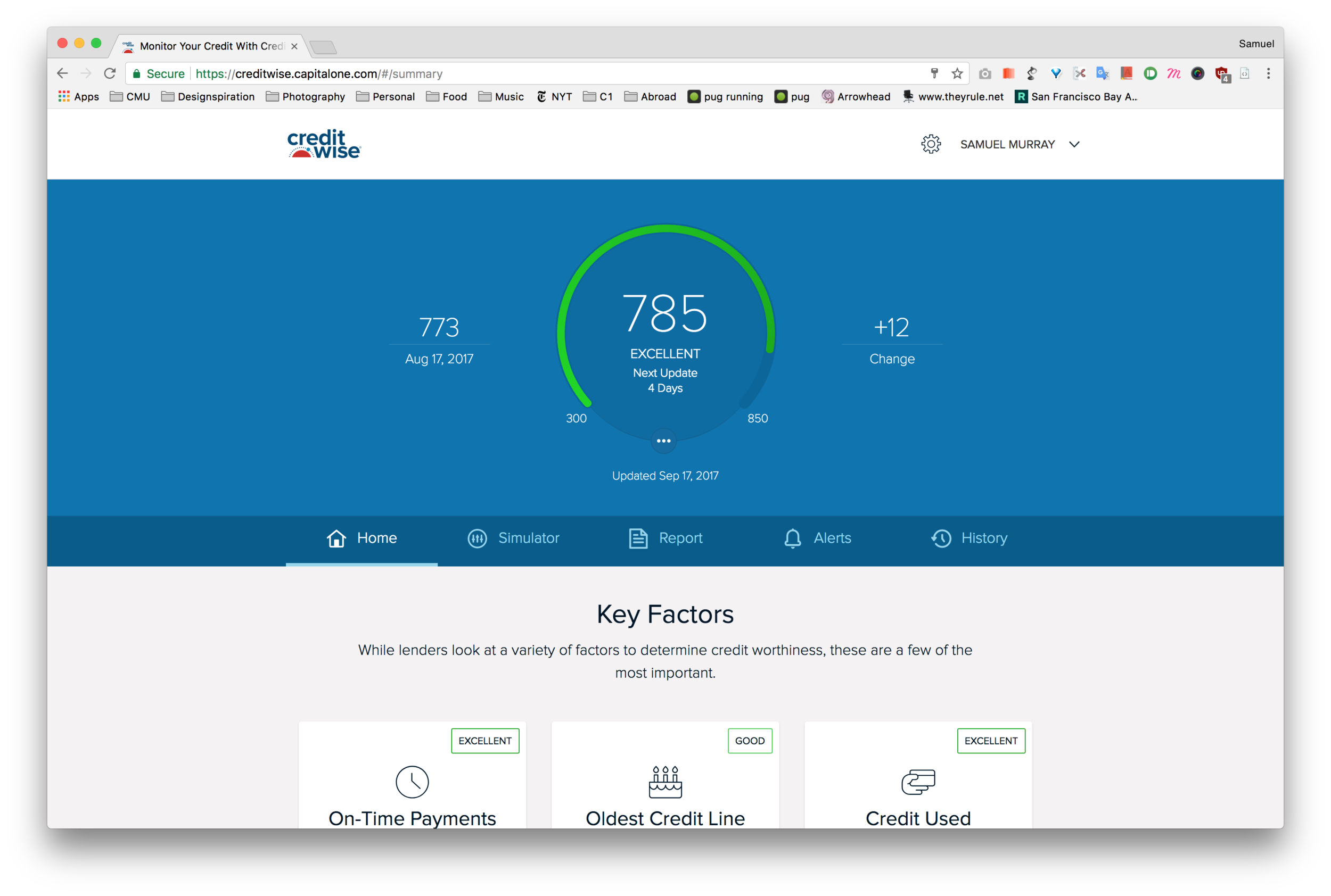
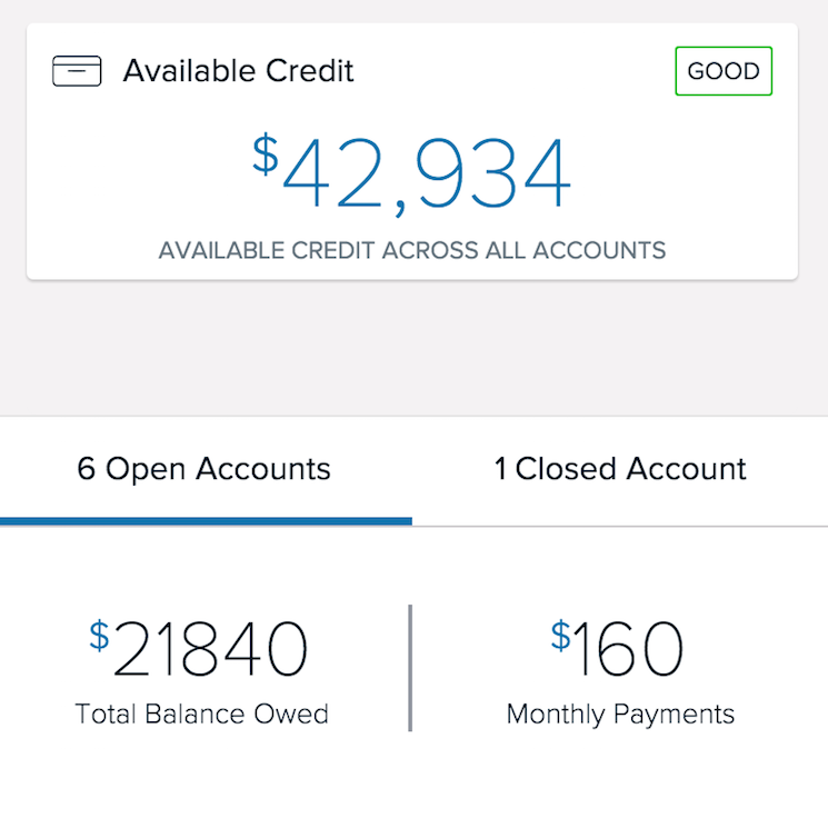
CreditWise Overview
Available on : iOS + Android + Web
I spent most of 2016 supporting CreditWise, Capital One's credit monitoring & education tool. The majority of my time on the product was spent integrating credit reports into the mobile and web applications. I helped run a week-long design sprint which led to a new navigation system for the product that simplified the UX while also referencing existing patterns to keep the interaction changes to a minimum.
If you have an up-to-date version of the app on your phone, you can see this new system in action right now!
current state of iOS & desktop applications


Tabular Navigation System
(Native App)
In deciding how to better structure Credit Wise for future features and usage, I developed and prototyped a bottom nav architecture for the whole system. This was one of three models we created and tested during the design sprint. User feedback and development feasibility helped us make the decision to move forward with this.
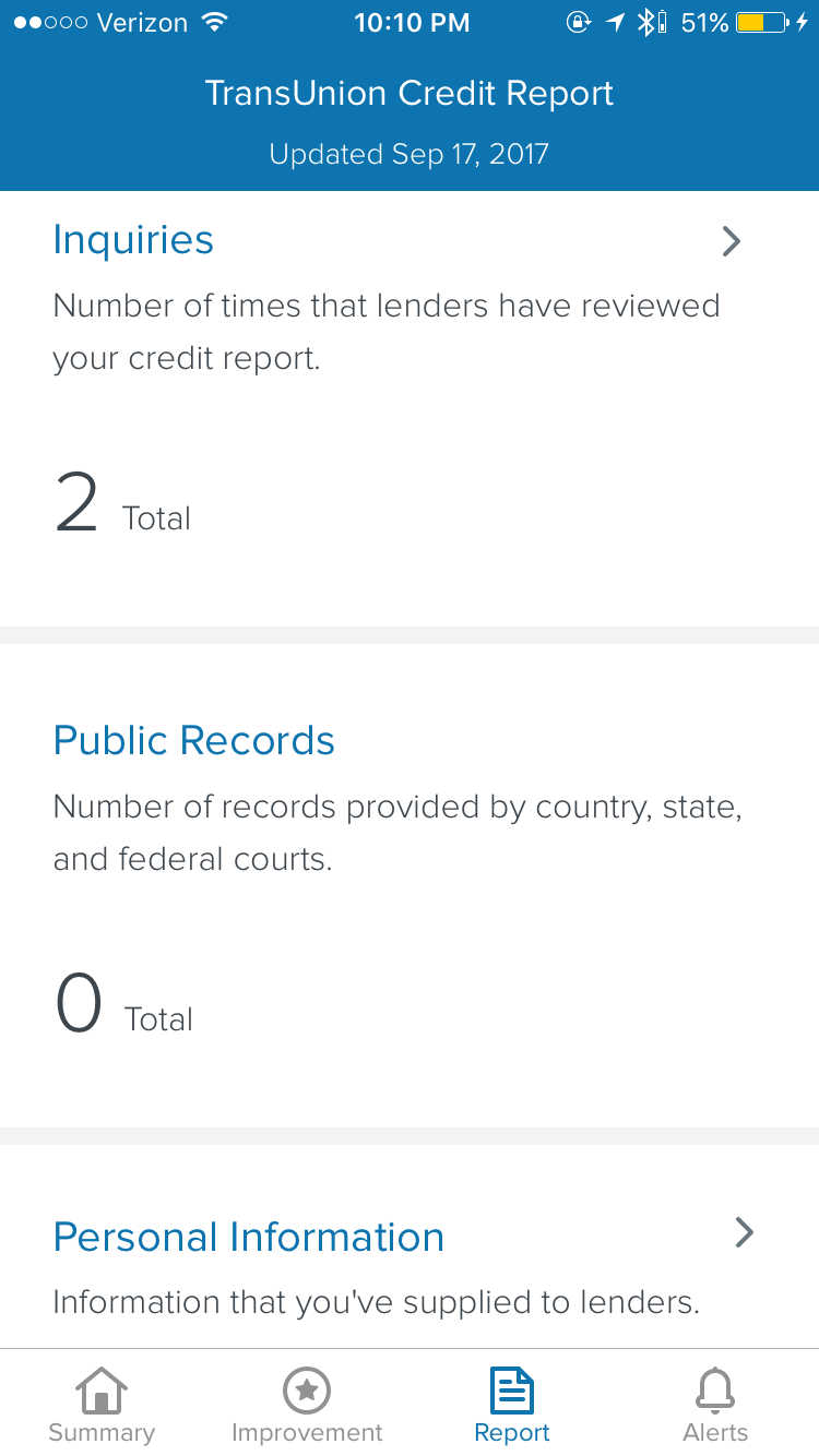
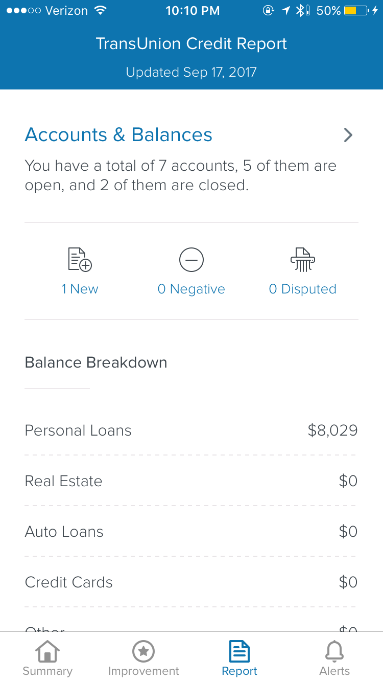
Credit Reports
Information Architecture + UX / Interaction Design + Prototyping
My work on the Credit Wise started with ideation around an external, non-interactive version of a customer's report, i.e. an exportable file to be viewed outside of the app experience. I started to dig around and learn about all of the various data points and hierarchy involved with each report. This led me to a quick experiment with mobile-friendly data viz, where I played around with the idea of summarizing each section's data before presenting the full information. Since the credit report data doesn't change that often, I assumed that having a glanceable view of each section's deltas was a good way to break up the monotony and old, unchanging data.


An initial audit of technology LOE concluded that the "PDF" approach would actually require more effort than an in-app presentation of the data, so I changed up my work from more print-focused to digital. To kick this off, I caught up on the team's existing design patterns to inform my decisions. This included breaking down the customer questions the team was using, looking at navigation structures, and setting up my documents to use the right type sizes, colors, spacing, etc.
early analysis of tasks + old design patterns
~


After getting a grasp of all of the older/existing systems, I started working on ways of presenting and interacting with this dense new chunk of customer data. Below are two Flinto prototypes showing off possible patterns that chunked the Credit Report data into columns and cards, respectively.
Horizontal Scrolling Menu Bar
(Mobile Web)
Our existing web navigation patterns at the time informed my decision to create a scrollbar for diving in to the credit report on mobile web. This version was not used in the end; rather than host all of the credit report data in a modal, we simply embedded it in the same space that Accounts & Balances lived in the old summary screen layout.
~
Z Index Cards
(Native App)
When exploring where one's credit report could live within the iOS app, my coworker and I developed an interaction model in which the data would exist as cards below the rest of the experience.
All of the information throughout the application is provided by credit bureau reports, and we wanted to communicate that by displaying in a lower, "foundation" level.